Author: Jennifer Hartnett-Henderson
-
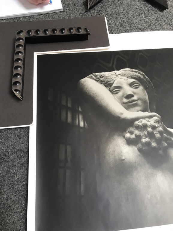
Frame It
Adding the right frame to a piece of artwork is like finding the right secret ingredient for a designer cocktail. I’ve seen work that does not stand by itself elevated to sublime by presentation alone. Whatever you have, give it the right surroundings and it will do well. Recently, I’ve had the pleasure of framing…
-
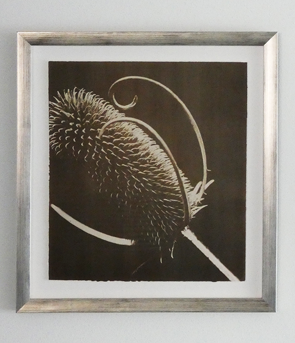
Use Contrast and Repetition
One of the things I love is seeing how people incorporate my artwork into their homes and how they make it their own. My friend and client Amy has done an amazing job incorporating this piece into her home and making it part of the fabric of the whole. Let’s take a deeper look. The…
-
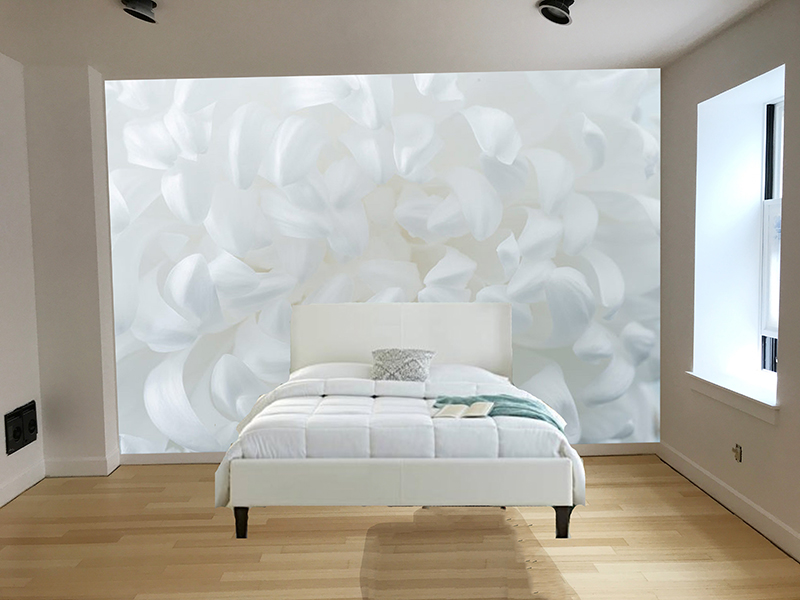
Mock it Up
When you want to be a little more sure of how the artwork will fit into the space, doing a mockup is an inexpensive and easy way to gain a greater peace of mind. It can be something cheap and cheerful that’s just enough or it can be more fully realized. Here are 2 examples…
-
Photo Book vs Photo Magazine
In my last post I wrote about finding a way to publish photo books cheaper as a magazine. In the process of creating a book and a magazine I learned a lot about the differences between the two. The medium really does matter! You’d think it would be easy to know the differences between a…
-
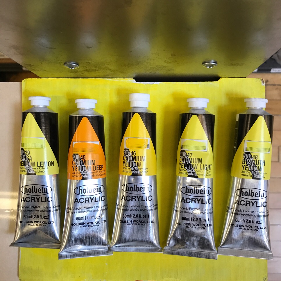
Clarify Your Color Language
I recently did a color consult for a client. The goal was simple: add a bright splash of the same color of yellow throughout the ground floor. The challenge was to more precisely distinguish which variation of yellow. Name It The first thing to do is add language to describe variations of yellow. A trip…
-
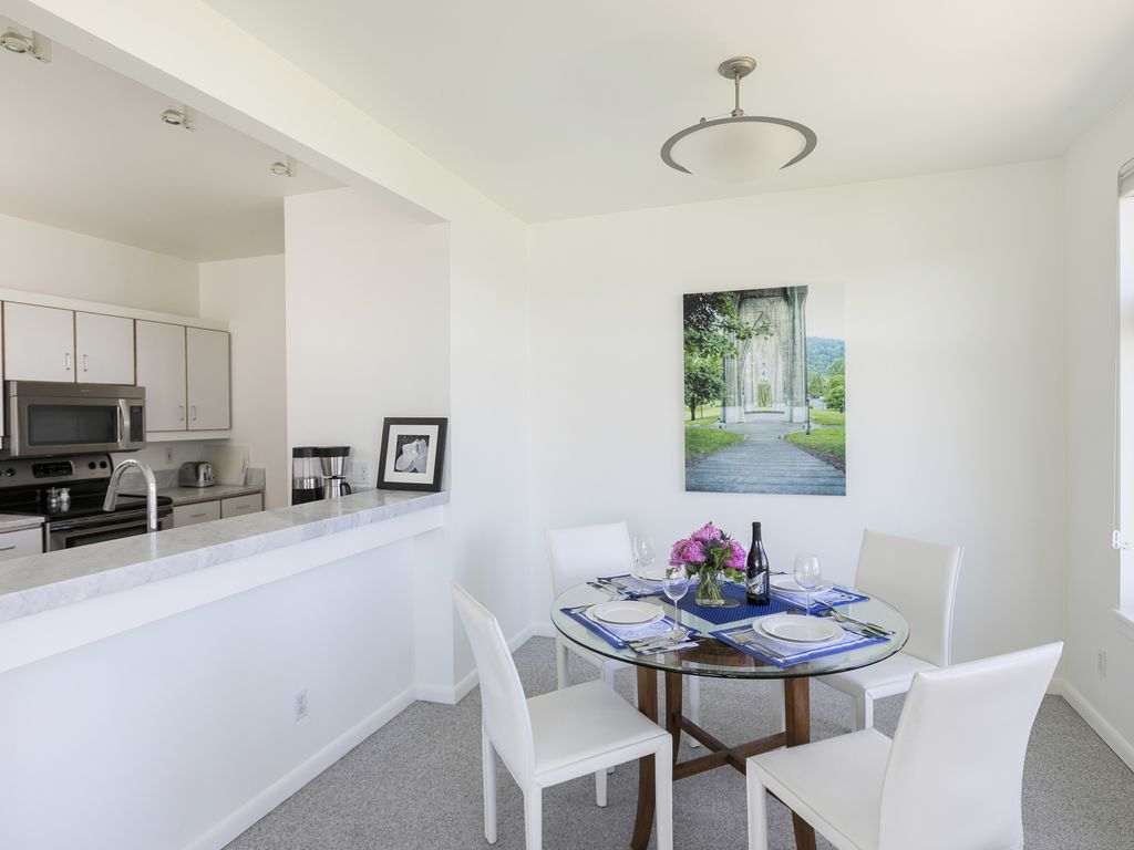
Make the Space Feel Bigger
Make the space feel bigger by using an image that leads you into the distance. The image below has a path and a succession of smaller arches that lead your eye into the distance. The Work I made this 35mm image of the arches that support St John’s bridge and the park underneath it on…
-
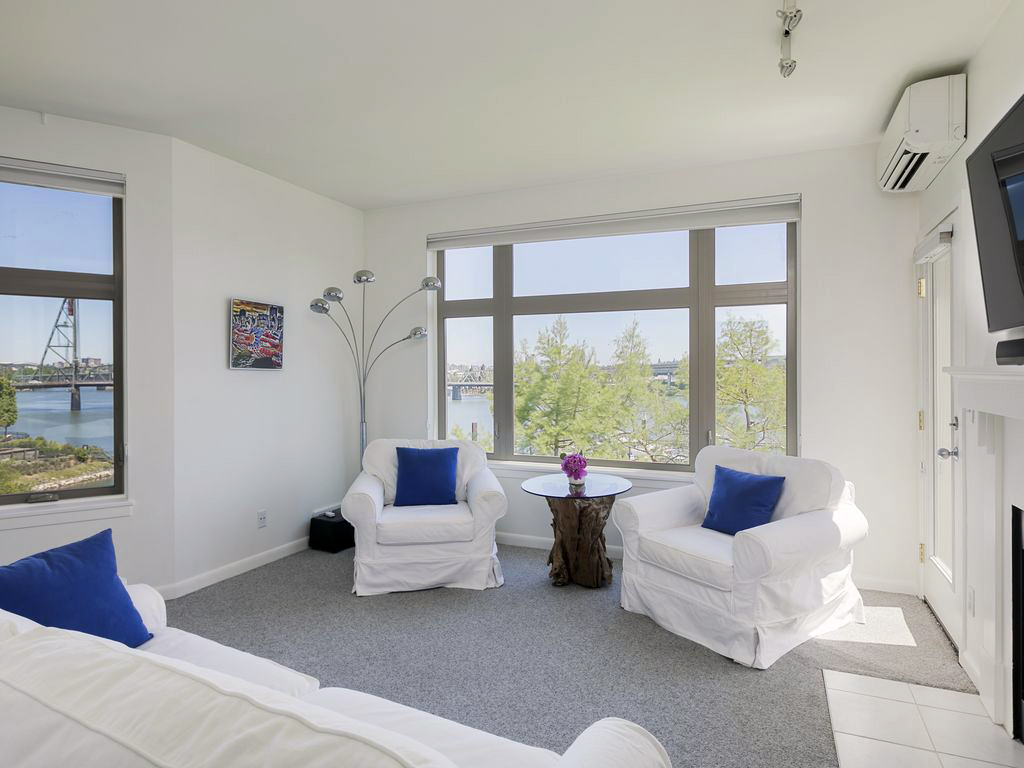
Pulse Color Throughout
The real star of the show in this client’s setting is the million dollar view. Bright blue pillows ground the interior with color pulses. The image on the wall has strong primary colors of red, yellow and blue and includes the same blue of the pillows. The dragon boat image is a local reference. Dragon…
-
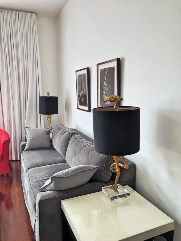
Add Tonal Contrast
Dark chocolate is luscious particularly when contrasted with a similarly dark gray. The gold lamp base makes a triple play with black, gray and chocolate. The black of the lamp shade anchors the ensemble. The Work These images are Van Dyke prints. Van Dyke is an alternative photographic process from the 1840s. I used hand…
-
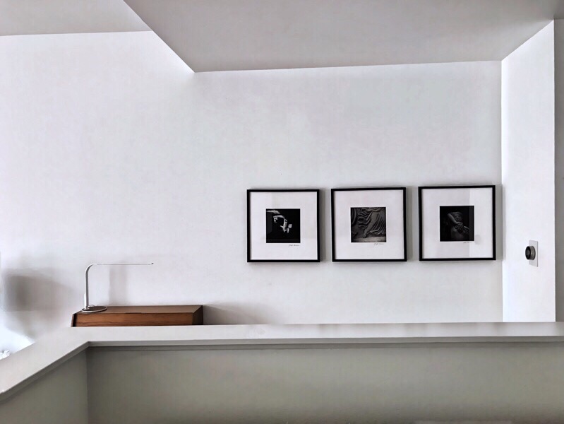
Activate a Hallway
Hallways are a great place to hang photos. In this case, the client’s hallway is visible from the bedroom so the photos also provide visual interest from there as well. Here is the view from the bedroom. And below is the view from the hallway. The photos are hung high so that people sitting on…
-
PSR: Publish Photo Books Cheaper
Problem What problem was I trying to solve? Independent publishing of printed photo books is expensive. For example, I experimenting with the same book on 3 different services and the average cost was $63: On Shutterfly, my 10 x 10 hardcover photo book, Myopia in Italy, of 42 pages was $90 WITH a coupon. On…

