Adding the right frame to a piece of artwork is like finding the right secret ingredient for a designer cocktail. I’ve seen work that does not stand by itself elevated to sublime by presentation alone. Whatever you have, give it the right surroundings and it will do well.
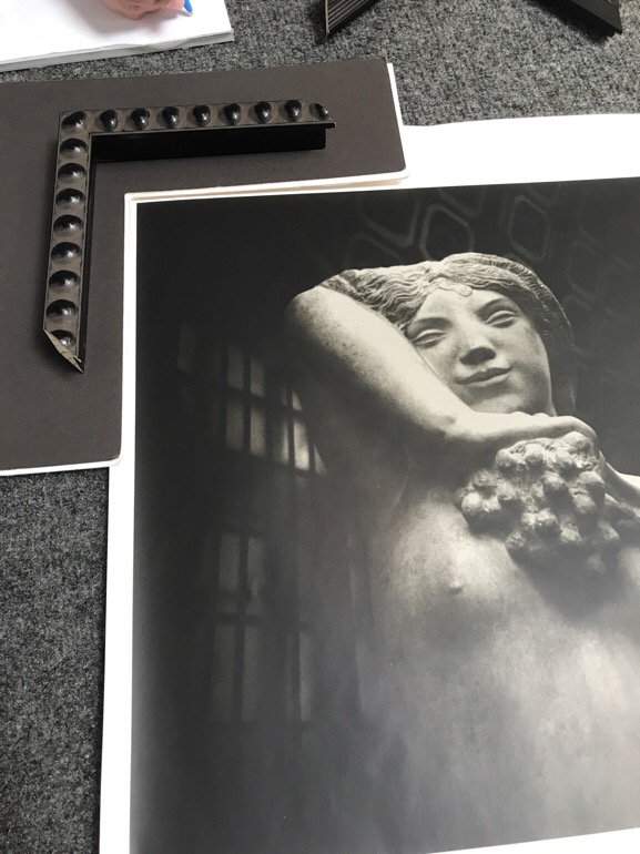
Recently, I’ve had the pleasure of framing a number of pieces of artwork. Each time I learn from the framer. First, I went to University Art to see what they would suggest. The framer selected frame stock that echoed shapes in each photo. For the first image, she keyed off the shape of the grapes and selected a frame that repeated that shape.
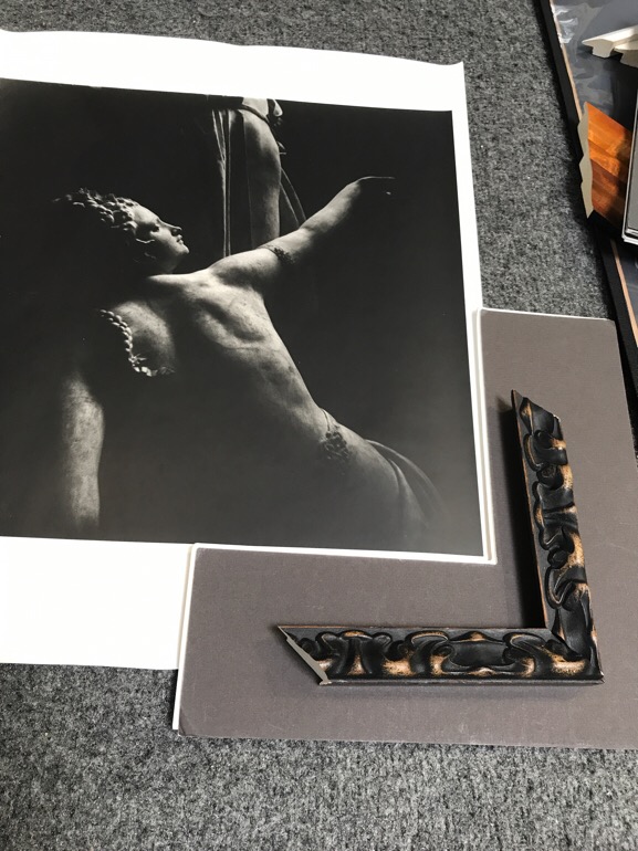
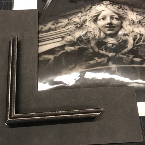
For the second image she chose to repeat the shapes in the hair and braid.
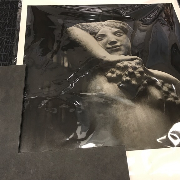
While I found these possibilities interesting, I wasn’t satisfied with where attention flowed and the white of the matte was jarring. So I walked away. A few weeks later, I went to Dick Blick’s to see what possibilities might recommend.
We experimented with matte colors that matched the tone of the image. This allows attention to flow to the image and not to the border.
We also played with repeating the dark/light tonal contrast in the image instead of repeating the shapes. The result was more unified.
I was very pleased with the final result which is still under wraps for now.
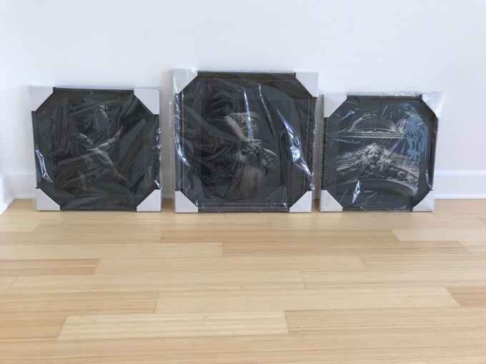
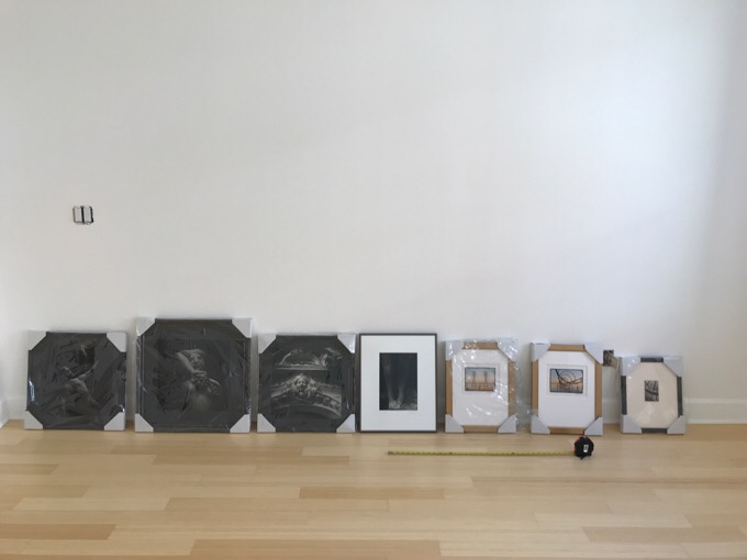
These will eventually be placed together on site. The frame is just the first context to consider. The next context is placement on a 2D plane. The next larger context is placement and lighting within 3D space. Once these are officially up, I’ll post about the movement from the narrow view (image only) to the installed view (on the wall, lighted). I can’t wait!