
One of the things I love is seeing how people incorporate my artwork into their homes and how they make it their own. My friend and client Amy has done an amazing job incorporating this piece into her home and making it part of the fabric of the whole. Let’s take a deeper look.
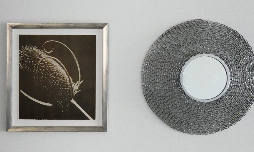
The Frame
Amy selected a frame that plays with contrast. The first contrast is temperature. The warm brown tones of the image play against the cool silver tones. The frame also plays with repetition. The warm tones are also repeated in the striations on the frame. The dark/light texture of the teasel as a subject is repeated in the variegated silver and brown in the frame.

The Wall
In a masterful move, Amy paired the patterned texture of the prickly teasel with an evenly textured mirror frame (repetition) and contrasted the almost square shape of the framed image with the circle of the mirror.
The Setting
The saturated cool cobalt teal table accessories in the foreground contrast well with the warm dark chocolate brown in the background and repeat the cool tones of the silver mirror. The texture of the blanket repeats the texture of the mirror and the teasel as well. Gorgeously done!

The Work:
What I as the artist especially appreciate about this is the contrast between the setting and the process used to create the work.
The setting is mid-century modern (1950s). Yet I created the work using a laborious (by smart phone standards) photographic process popular in the 1840s. First I:
- Hand coated large sheets of Arches or Rives BFK watercolor paper with Van Dyke emulsion and let it dry in absolute darkness.
- Then I placed a 16 x 20″ lithographic positive (that I made from a 35mm negative) on the paper and held it firmly in place (in a contact printer).
- Then I exposed the negative using the sun or a very large lighting unit.
- Lastly I rinsed the emulsion off the paper in the darkroom and let it dry in the darkroom.
Each print from start to finish took days to make. The warm dark brown tones can be easily replicated in Photoshop (more efficient) but the texture of Van Dyke emulsion on watercolor paper only comes from using this process.
