

In my last post I wrote about finding a way to publish photo books cheaper as a magazine. In the process of creating a book and a magazine I learned a lot about the differences between the two. The medium really does matter!
You’d think it would be easy to know the differences between a book and a magazine because we read them all the time. All I can say is that the practice of creating a photo magazine, Myopia in Britain and contrasting that with creating my eighth photo book, Myopia in Italy, has given me a more intimate appreciation of what goes into the design and a much enlarged mental map of what is possible. Let’s start with something simple.
Spine
My mental model of a magazine read “saddle-stitch” in which folded sheets are held together by staples regularly spaced up the spine. Whereas my mental model of a book said perfect-bound where the pages and the cover are glued together usually at the left edge. What I discovered is that indie published magazines don’t have to be saddle-stitched. They can also be perfect-bound just like the fancy mags Elle Decor and Architectural Digest.
Paper
For my indie published books, I had been able to select from a number of papers. For example, Blurb offers a variety of surfaces and weights. (Note: I’m not able to use Artifact Uprising and Shutterfly as examples because they do not offer magazine publishing services.)
- Standard 80#
- Premium Lustre 100#
- Premium Matte 100#
- Proline Uncoated 100#
- Proline Pearl Photo 140#
- Standard Layflat 100#
I had assumed that magazine paper would be high gloss and a much lighter 60# paper. What I discovered is that the same heavier paper is also an option. For example, Blurb offers
- Cover: 80# Semi-gloss (216 GSM) for heft and protection
- Paper: 80# Matte text (118 GSM) paper
- Cover: 65# Semi-Gloss (176 GSM) (Economy)
- Paper: 60# Gloss text (89 GSM) (Economy)
Layout
In my photo books to date, I had focused on one or two images per page for the most part (although I did sneak in a nine-up and a four-up here and there) because the images were the focal point. In an 8.5″ x 11″ magazine, the portrait or vertical format meant that 2 horizontal images on one page or one vertical image on one page fit best. But that image density and layout didn’t feel right. It felt more natural to put several images of different sizes and orientations on one page along with text.
I wasn’t sure if my preference was a result of reading magazines or if it was something that happened because of the format. So I checked out what the real pros do.
I stopped by Powell’s books in Portland, Oregon and thumbed through the gold standard, LensWork, a premier photo magazine that has won the Benjamin Franklin award (aka the “Oscar” of the printing industry) five times. That’s more times than anybody else. LensWork was perfect bound on heavier paper in smaller vertical format. A single image or two covered most of the page. Where there was text content it was a full page. No ads. The printer was Hemlock Printing.
So the layout can be anything you want it to be. It depends on what you’re trying to accomplish.
Images
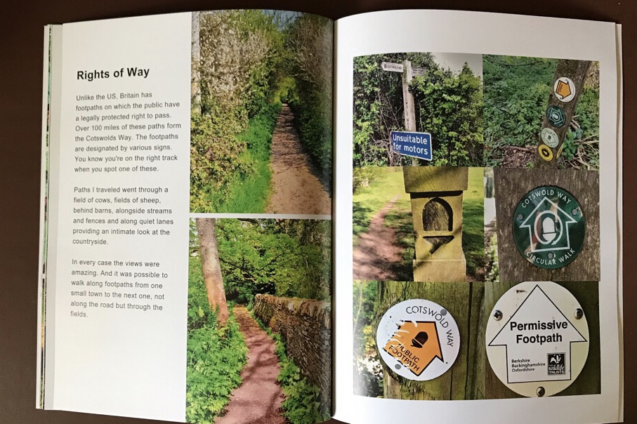
Rather than select that one best image in each case like I did for photo books, I selected groupings of images that helped illustrate an experience, for example, of driving in Britain or of drinking beer at a pub.
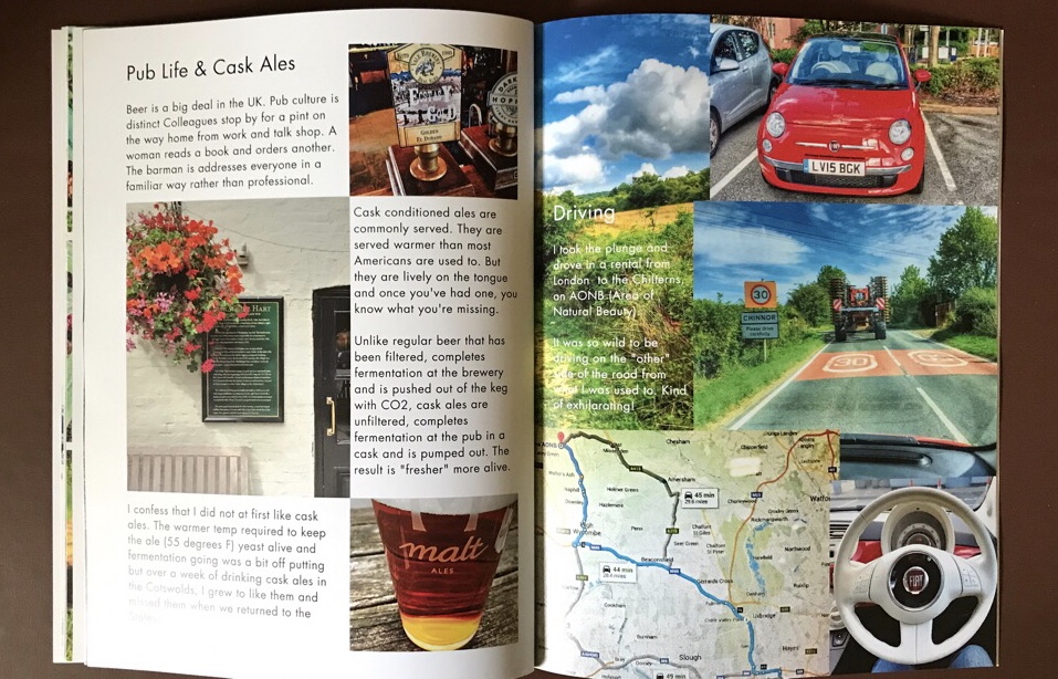
When I do a photo book about the same topic, 90% of these images will not make it in. The advantage of having all of them is a more rounded view but the result (at least of my initial effort) is less art and more information / illustration. A very interesting shift.
Words/Text
What to say, what to say! As a photographer, I don’t use text a lot. Often I don’t even use titles though I should. Coming up with the text meant figuring out what to say about a grouping of images. What story to tell. The inclusion of text is another subtle shove from art to illustration / information. In a photo book, a poem about each image would balance the importance of the image with the words more.
And there’s the decision of whether to lay text over images and/or beside images. When does text over an image make the image “more” and when does it diminish the image.
Perception
This project was the culmination of a labor intensive post-travel process that took hours that I didn’t keep track of. I:
- found 1,000s of images from various years
- looked through all of the images
- chose about 200 to examine more closely and edit,
- selected 93 of those for the final edit
- arranged those 93 images over 30 pages
- wrote accompanying text
Overall, I’m very impressed with the magazine format and am considering whether to do more of my future work in this format following LensWorks layout and emphasis. I hope you enjoyed!

I really enjoyed the comparison! I like the idea of the magazine format creating an urge for words (speaking as someone who writes looooong captions to my own pictures), and the way it’s allowed you to group the photos into themes. Thank you for this analysis!
LikeLiked by 1 person
Hi Karen thank you for reading! And for your feedback. If you’ve got long captions it sounds like you’re already almost there in the words department. Thanks again. It’s great to know this is useful to you!
LikeLike