A recent post on Understanding the Differences Between Type and Lettering by Joseph Alessio (@alessio_joseph) on Smashing Magazine shared by The Sketchnote Army (@sketchnotearmy) plus Mike Rohde‘s (@rohdesign) illustration of sketchnote type in his book The Sketchnote Handbook got me noticing letters.
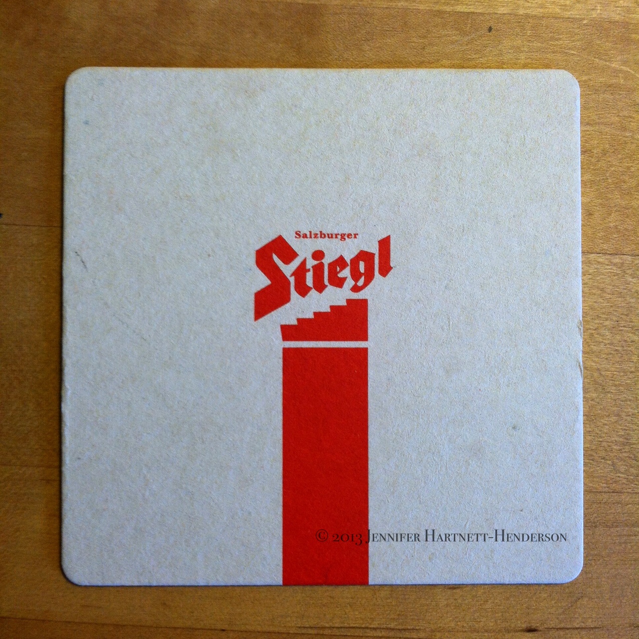
Sunshine Gardens was the first font to piqué my interest. Dinner at Steakout, a beer garden, yielded another treasure, the Stiegl font on a coaster:
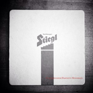
In black and white, it’s easy to notice the sculpted tails of each letter and the slanted angle of the stair steps:
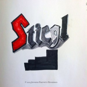
Definitely worth a closer look so I spent some time with the coaster and my Tomboy dual flow pens and other tools while “noticing what I noticed” as Lynda Barry teaches:
It may seem odd to find the font in a photography blog. However, noticing what you notice in the Wow! Amazing! Everyday! is a great way to improve your visual eye and photography. Much of photographing is about seeing and not all seeing is noticing. Like Georgia O’Keefe said, “to see takes time – like to have a friend takes time.”
What did you take the time to see today?
Related articles
- Better typography for IPython notebooks, now (healthyalgorithms.com)
- Sketchnote Neighborhood Font Find (jenniferhartnetthenderson.wordpress.com)
- The Sketchnote Handbook: A brilliant new guide to visual note taking (mindmappingsoftwareblog.com)


